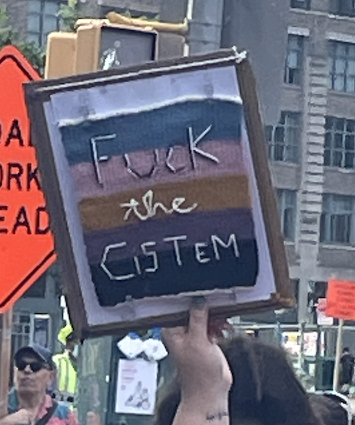
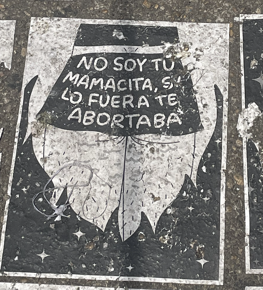
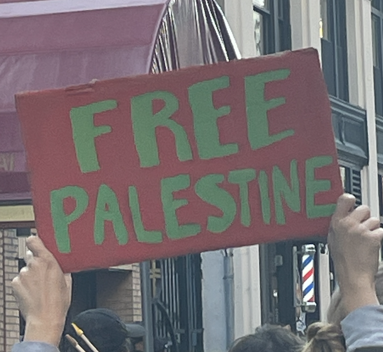
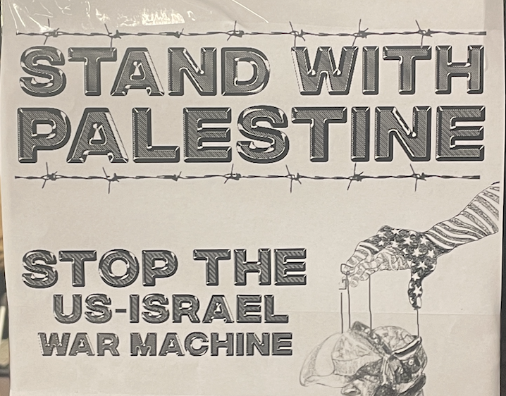
The typography used in political protest signs thus plays a crucial role in shaping design practices by emphasizing the power of visual communication in effecting social and political change.
Political Type
March for our Lives | New York, USA
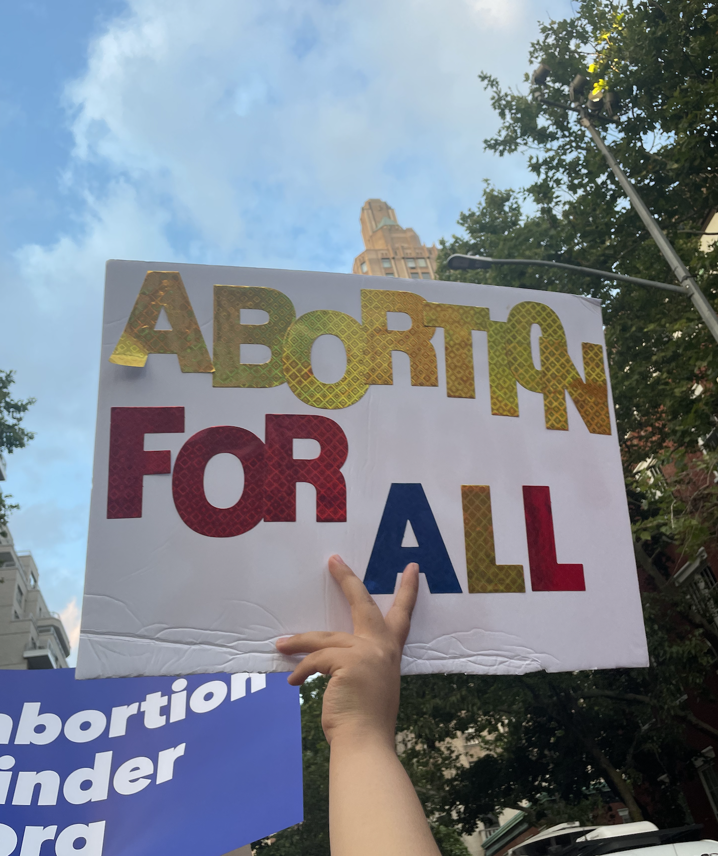
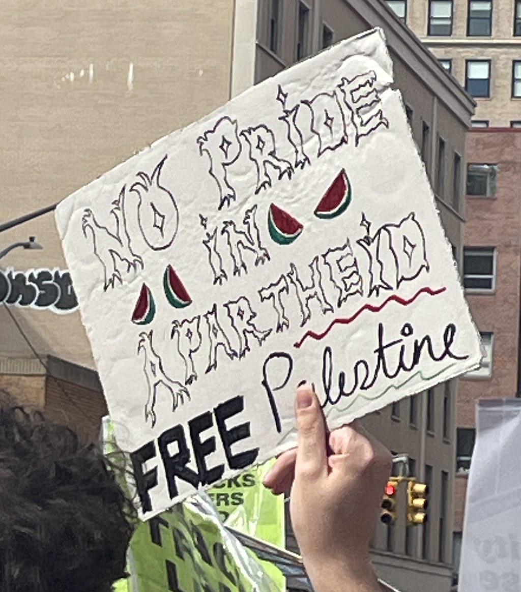
The typography used in political protest signs serves as a visual expression of dissent, activism, and the demand for change. These signs are often created hastily and with limited resources, resulting in a raw and unpolished aesthetic. However, this rawness and immediacy convey a sense of urgency and authenticity, reflecting the grassroots nature of political movements. The typography used in these signs often features bold, impactful lettering, emphasizing key messages and slogans. The designs are straightforward, ensuring legibility even from a distance, as protesters aim to communicate their demands to a wide audience. The powerful use of typography in political protest signs has a direct link to political progress, as it allows individuals to visually and effectively convey their grievances and aspirations. In turn, this influence extends to typography in general design practices, where designers are inspired by the boldness, simplicity, and directness of protest signs. They incorporate these elements into their work to create designs that capture attention, convey messages clearly, and evoke emotional responses.
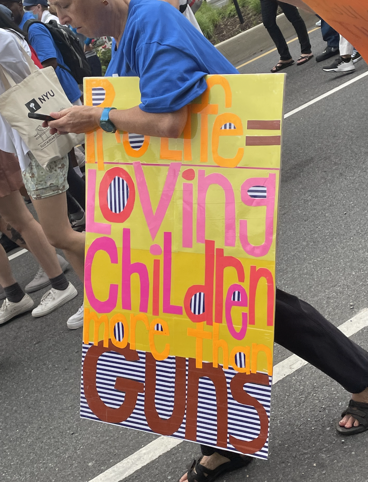
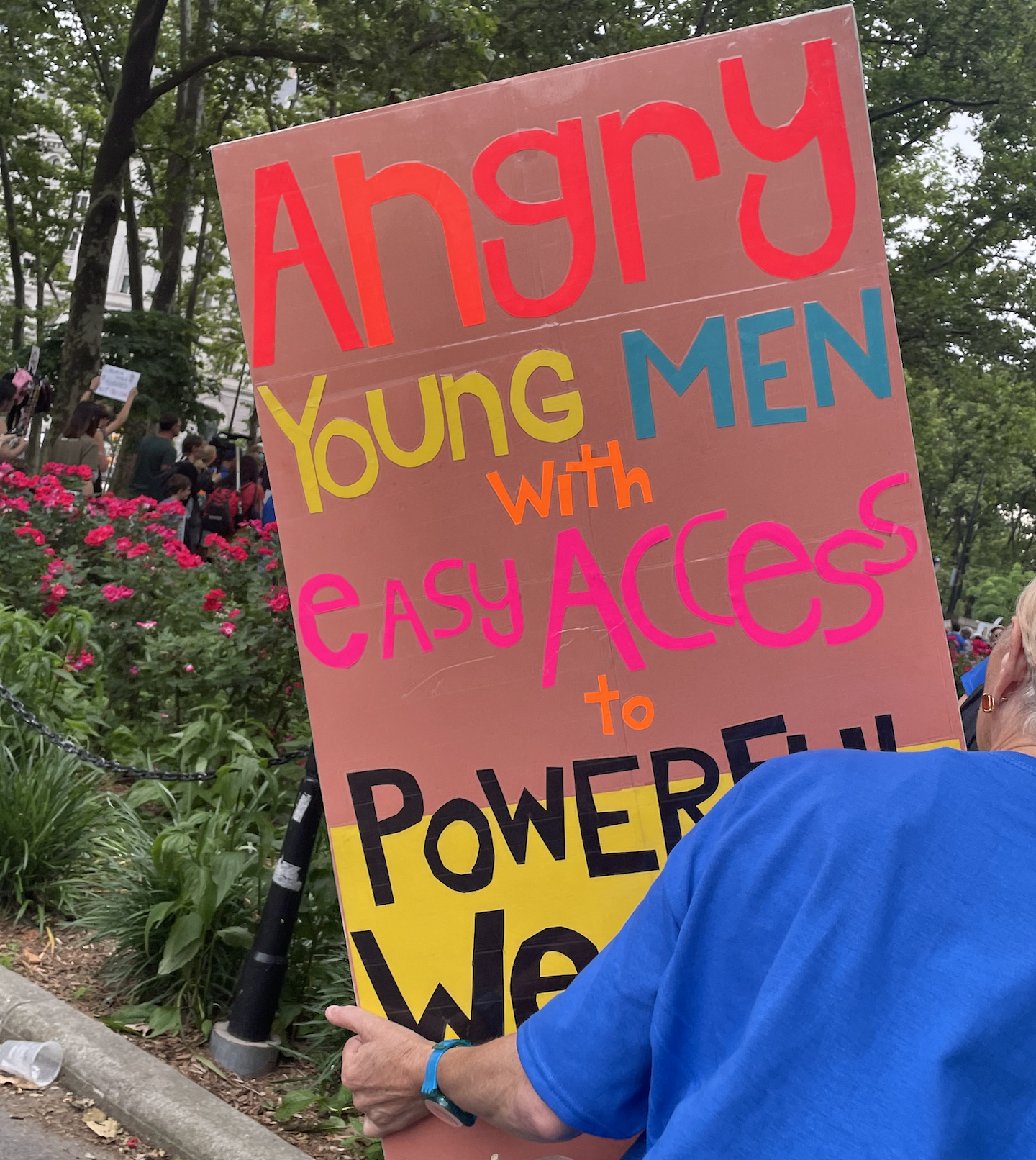
The example here was a sign I saw when attending a rally against gun violence in New York after the devastating shooting in Uvalde, Texas. I really appreciate the various cut-out sizing and mixture of both capital and under-case letters, seemingly at random. The bright colors of the top were clearly designed to grab attention whereas the letters of “Powerful Weapons” at the bottom were black for full impact as to the severity of the situation. The curvature of the “g” and “y” in the word Angry are rather playful for such a sober event, however, eludes to how “grassroots” these anti-gun organizations and rallies are in the face of a government that would rather protect the 2nd amendment rather than lives.
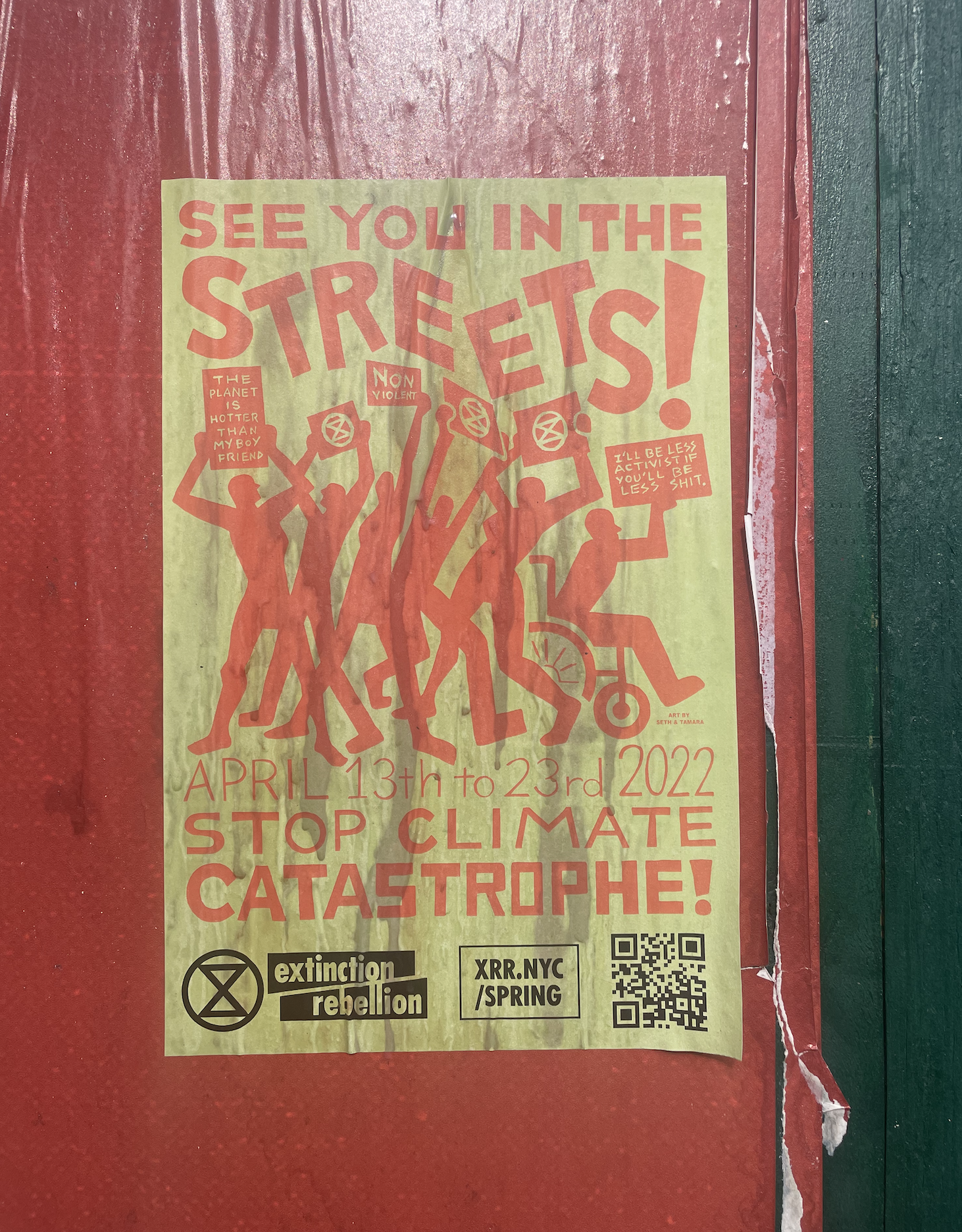
I came across this poster plastered on a construction wall in Brooklyn, NY. I have heard of extinction rebellion before and I know they are a climate activist group that operates internationally. I found it exciting to see a sample of a poster that exhibited other “mini-posters” within the design. The typography has a very “hand-written” quality to it minus the rather square accents that can be seen in examples such as the “U”, “A”, “S” “R” and “P” letters. These angular shapes of the lettering give the words “catastrophe” and “see you in the…” a rather mechanical feel. Inversely, “streets” seems more whimsical and dynamic which references to the grass-roots power that exists only in the streets where communities gather.
“It is critical that we collect so this moment does not get lost. We talk to people so we don’t forget their stories. History is happening right before us.”
— Aaron Bryant, a curator at the National Museum of African American History and Culture regarding the curation of posters from BLM
